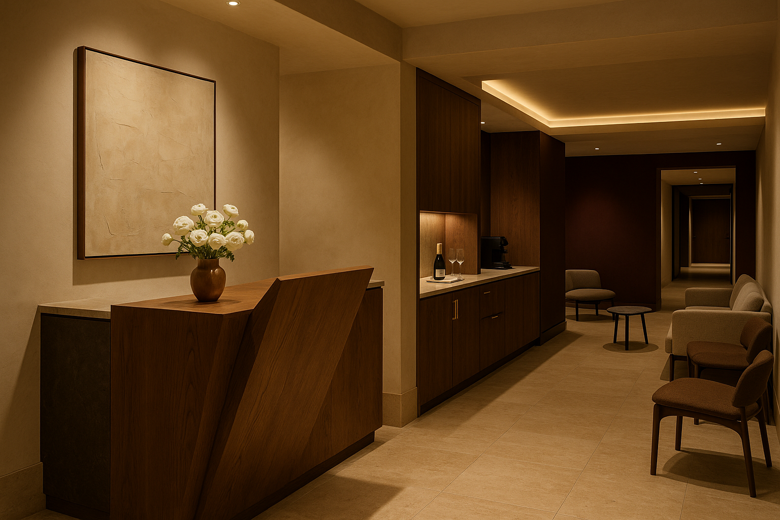
STUDIO NOIR
Visual Identity
The look. Palette, typography, logo direction, materials, signage, photography. If it renders on a screen, a wall, a garment, or a printed page for STUDIO NOIR, it obeys this file.
Reference frame: eighteentwentysix.com editorial restraint. Aman Tokyo materials. Kinfolk photography discipline. John Pawson negative space. Every choice earns its place.
1. Palette (Taj’s, locked 2026-07-28)
Five colors. That is the entire system. No accent, no seasonal drop, no exceptions.
Soft Cream (base)
Hex: #F0E6D3
Role: primary background. Walls, digital backgrounds, printed paper, member folios. Reads warm, unbleached, luxury-hotel.
Black Noir (structural)
Hex: #0D0D0D
Role: primary type, hardware, steel frames, black-tie signage. Never pure black (#000000). Always the softer Noir.
Espresso (depth)
Hex: #2B1E15
Role: rich accent for headings on cream, deep-wood millwork tones, secondary type where Warm Taupe reads too light. Sits between Black Noir and Warm Taupe.
Warm Taupe (breath)
Hex: #6A5F52
Role: secondary type, dividers, subtle UI states, printed captions. The connective tissue between cream and black.
Champagne Gold (metal)
Hex: #B8935A
Role: hardware finishes, brass detailing in digital, foil press on print, wordmark accent on select applications. The warm luxury metal that reads Taj.
Banned: - Green in any shade. Non-negotiable. Standing rule per [[feedback-dossier-palette]]. - Neon, fluorescent, or high-saturation color of any kind. - White. Soft Cream replaces it. Do not substitute white for cream on any print or wall. - Gold-yellow. Champagne Gold replaces it. - Rose gold. Reads dated. - Oxblood. Was in an earlier draft. Not in Taj’s palette. Dropped.
2. Typography
Three typefaces. All licensed. All used deliberately.
Fraunces Italic (voice)
Role: display, editorial headlines, founder’s signature, competition graphics, the wordmark’s poetic layer. Never body copy. Italic weight only for STUDIO NOIR. The upright roman is off-limits inside the brand.
Use cases: - Page headers on the site - Single-word or single-phrase moments on signage - Founder’s letter opening - THE NOIR INVITATIONAL wordmark treatment (Phase 2)
Söhne (structure)
Role: primary body copy, UI, navigation, staff-facing docs, editorial subheads. Söhne Buch for body. Söhne Kräftig for subheads. Söhne Halbfett only when structural weight is needed.
Fallbacks in order if Söhne is unavailable: 1. Neue Haas Grotesk Text 2. Inter Tight
Use cases: - All body copy - App and web UI - Menu body (Phase 2) - Membership card details
Söhne Mono (functional)
Role: specs, class times, coach names on signage, receipts, timestamps, and (Phase 2) competition scoring displays.
Use cases: - Class schedule - Recovery temperatures (Phase 2) - Locker numbers
Type rules: - Never mix Fraunces Italic with Söhne on the same line. Line breaks between them. - Body copy is set at generous line height (1.5 minimum). No cramped copy anywhere. - Tracking on Fraunces headlines can open up. Söhne body stays neutral. - Never use faux italic on Söhne. If italic is needed, Fraunces takes it. - All caps allowed for STUDIO NOIR, THE NOIR INVITATIONAL, and small navigational labels only.
3. Logo Direction
The STUDIO NOIR wordmark is the identity. No pictorial mark, no monogram, no icon system, at least not in Phase 1.
Wordmark form
Fraunces Italic, all uppercase, generous letter spacing. Set on Soft Cream in Black Noir or Champagne Gold. Set on Black Noir in Soft Cream or Champagne Gold. Never set on Espresso. Never set on an image without a solid field behind it.
Wordmark rules
- Minimum clear space: one cap-height of the “S” on all sides
- Minimum size: 24 px digital, 0.5 inch print. Below that, do not use it
- Never stretched. Never outlined. Never given a drop shadow. Never rotated
- Champagne Gold on Soft Cream is the signature pairing. Use it on the front door signage, the printed folio, and the founder’s stationery
Sub-brand lockups (Phase 2 forward)
Sub-brands (STUDIO NOIR DIGITAL, STUDIO NOIR CAFÉ, THE NOIR INVITATIONAL) share the wordmark and add their name in Söhne Kräftig small caps, set below with a hairline rule between. Never above. Never larger than the parent.
Founder’s signature mark
Taj’s actual handwritten signature, scanned and cleaned, is a permitted secondary mark. Used only on: - The founder’s letter - Personal notes to founding members (The Founders charter cohort) - Limited-run apparel drops she personally endorses
4. Materials Palette (Physical)
Every material chosen for the studio appears in the visual identity system too. Photography, renders, and print materials should reflect these surfaces.
Phase 1 boutique uses a stripped-down materials set (we cannot afford travertine floors on a $30K cash buildout with no landlord TI assumed). Phase 2 flagship expands to the full materials palette. Both stay inside the palette.
Phase 1 materials (essential)
- Warm oak (millwork). Reception desk, wall paneling accents where budget allows. Rift-sawn, oiled finish, no gloss.
- Black steel (structure). Mirror frames, stair rails, hardware. Matte, powder-coated.
- Soft cream paint (walls). The room reads cream, not white.
- Sprung floor with warm-toned marley top layer. Movement surface.
- Cream linen (soft goods). Robes for founders’ cohort, towel service, upholstery. Heavy weight.
- Champagne Gold hardware. Door pulls, locker latches, signage frames. Not polished, not lacquered.
Phase 2 materials (added at flagship)
- Travertine (floor and wall stone). Warm, unpolished, honed. Cream palette natively.
- Espresso oak (contrast millwork). Café counter, retail fixtures.
- Espresso velvet (singular moment). One statement piece per space (a lounge banquette, a curtain to a private studio). Never more than one per room.
Banned materials: - Chrome. Reads gym. - Glossy tile. Reads spa chain. - Any faux wood, faux stone, faux leather. - Neon lighting. Ever. - Vinyl signage, plastic wayfinding, laminated menus.
5. Signage Principle
Silent by default.
Signage exists only when a member truly needs to read something. Wayfinding is done with architecture, materials, and staff, before it is done with words. When words are needed, they are set in small Söhne on Champagne Gold plates, warm oak inlays, or foil-pressed on cream folios. Never on backlit acrylic. Never oversized. Never in more than three lines.
Locker numbers (Phase 2) are engraved Champagne Gold on oak. Class schedules are set on a single printed folio at the concierge desk, refreshed daily. Studio names (Phase 2 flagship) are foil-pressed cream cards inside Champagne Gold frames beside each door. Recovery specs (Phase 2) are engraved into a single small plate at the entry to each room.
Where there is no plate, the staff is the sign. If a member has to ask twice for the same thing, that is a signage failure and a plate gets added.
6. Photography Direction
The image system is the second-loudest thing in the brand after the wordmark. Get it right or leave it out.
Photographic principles
- Natural light first, always. If natural light is not available, tungsten-warmed lighting only. Never cool white. Never ring light.
- Skin over screen. Skin tones are photographed to look correct in a warm room, not on Instagram.
- Space over subject. Half the frame is the room. The member is centered inside it, not filling it.
- Restraint on faces. Members are photographed in profile, from behind, or in mid-motion more often than head-on. Direct-to-camera portraits used sparingly, only with signed release.
- No product shots on white. Everything sits on cream, oak, or linen.
- No stock. Ever. Every image is commissioned. If no commissioned image exists for a use case, ship without an image.
Reference tier
Kinfolk-era editorial. Aman brand book. KITH lookbook. Peninsula Hotels imagery. Cereal Magazine.
Video
Same rules. No fast cuts. No text overlays inside the frame. Ambient sound over music where possible. When music is used, it is composed for STUDIO NOIR by Trill or an assigned in-house team.
The Walker Group produces all broadcast-grade footage for THE NOIR INVITATIONAL and any hero brand films.
7. Layout and Grid
Wide margins, generous white space, single-column body for editorial materials. Two-column only for menus and schedules. Cream stock, uncoated, minimum 100 gsm for folios and 300 gsm for cards. Champagne Gold foil press on covers and founder’s stationery.
Digital
12-column grid, generous gutters. Type sits inside a comfortable measure (65 to 75 characters per line). Full-bleed imagery only for hero moments. Never wall-to-wall type.
Motion (site and app)
Minimal. Fades and slow reveals, never bounces or springs. Cursor magnetism and Lenis-style smooth scroll are acceptable if implemented with restraint. No parallax stacks. No auto-play video with sound.
8. Wordmark and Apparel
The wordmark on apparel is embroidered or debossed. Never screen printed. Never larger than a coin on any staff garment. On member apparel, the wordmark may sit at chest or hem, in cream on black, black on cream, or Champagne Gold on either.
9. Do Not
- No pattern library. STUDIO NOIR has no patterns.
- No icon set beyond a minimal, custom-drawn set of five wayfinding glyphs (Phase 2 only: studio, café, concierge, recovery, lockers), commissioned as needed.
- No illustration.
- No stock photography of hands, water droplets, candles, or any other wellness cliché.
- No before-and-after member photography.
- No branded merch that reads promotional (no keychains, tote bags with big logos, water bottles with the wordmark blown up).
10. The Test
Print any piece of collateral. Set it next to a printed page from Cereal Magazine, an Aman hotel folio, and a KITH lookbook. If STUDIO NOIR holds its own in that stack, it ships. If it feels louder, thirstier, or less considered, it goes back.